How Do You Write Upgrade Path Documentation for a Freemium Product?


If you sit behind a product analytics dashboard long enough, you will eventually watch a user do something entirely irrational.
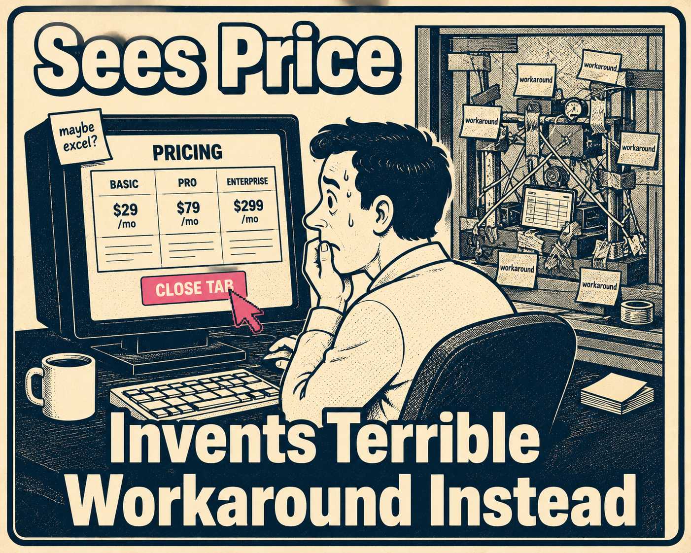
They will hit a feature limit on your free tier. They will click the "Upgrade" button. They will land on the pricing page, hover over the new monthly cost, and then they will close the tab and try to find a hacky, terrible workaround using the features they already have.
They do not do this because the paid tier is too expensive. They do this because they are afraid.
Freemium models are built on the promise of frictionless entry. You give users a taste of the product, they build a habit, and eventually they need more power. But the transition from free to paid is almost never frictionless. When a user considers upgrading, they aren't just thinking about what they gain. They are terrified of what they might lose. Will their existing data migrate correctly? Will their team lose access if they don't buy enough seats? If they downgrade later, does their work get locked behind a paywall, or deleted entirely?
This is loss aversion, and it is a powerful psychological force. People feel the pain of losing something roughly twice as intensely as the pleasure of gaining something equivalent. When a user hits a freemium limit, they are in a vulnerable state. If your documentation doesn't immediately answer their fears about data safety, access control, and billing mechanics, they won't upgrade. They will churn.
Writing upgrade path documentation for a freemium product isn't about marketing the premium features. It is about systematically dismantling the anxiety of the transition.
Why Freemium Is Harder to Document Than a Free Trial
In a traditional free trial, the user knows the clock is ticking. They evaluate the product, the trial ends, and they either buy or leave. The relationship is transactional from the start.
Freemium is different. Users build real workflows on free tiers. They invite colleagues. They store data. They rely on the product. When you ask them to upgrade, you are changing the rules of a relationship they have already established.
This is why freemium conversion rates are so low. The majority of SaaS companies using freemium achieve conversion rates of only two to five percent. Part of that is product design. But a significant part is documentation failure. Users who are ready to pay still don't upgrade because they can't get clear answers to basic operational questions.
The support burden is real. Industry data puts the average cost of a SaaS support interaction at around $10. Companies that dramatically improved their documentation saw support ticket volumes drop by 26% to 66%. If your upgrade path is confusing, you aren't just losing conversions. You are actively burning cash on tickets from users trying to figure out how to give you money.
Freemium also generates more edge cases than a free trial ever will. What happens to a user who has been on the free tier for two years and has accumulated data that exceeds the storage limits of the plan they're upgrading to? What happens to a team that upgrades mid-month when some members are on different roles? What happens to a user who was grandfathered into a legacy free tier that no longer exists? A free trial doesn't produce these scenarios. Freemium does, constantly.
What the Documentation Actually Needs to Contain
Upgrade documentation needs to answer the operational questions that marketing pages gloss over.
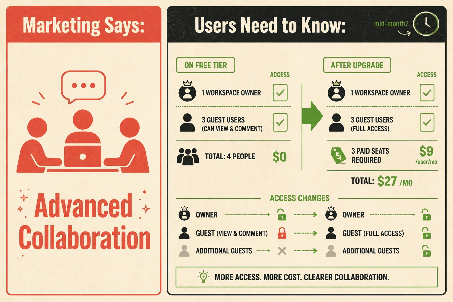
A pricing page might say "Advanced Collaboration." The documentation needs to explain exactly what happens to the three guest users currently on the free account when the workspace owner upgrades to a tier that requires paying per seat. That is a different question, and it is the question users are actually asking.
The most important content to cover is feature comparison at the technical level, not the marketing level. The difference matters. A marketing comparison table says "Unlimited projects." A technical comparison table says "Free tier: 5 projects. Pro tier: unlimited projects. Projects created on the free tier are retained and accessible after upgrade. No migration required." The second version answers the fear. The first version creates it.
Billing mechanics deserve their own section. Proration is confusing. If a user upgrades mid-month, do they pay the full amount immediately, or is it prorated? If they downgrade, do they get a credit, or do they just keep premium access until the end of the billing cycle? The math should be stated explicitly, not left to inference. Users who don't understand what they'll be charged will not complete the upgrade.
Data continuity is the biggest hurdle. You must explicitly guarantee that upgrading will not break existing workflows or require a manual migration. If there is any sync required, document the expected duration. If there is no migration at all, say that clearly. "Your existing data will be available immediately after upgrade, with no action required" is a sentence that converts users. The absence of that sentence is a sentence that doesn't.
The downgrade path is where most documentation fails entirely. It seems counterintuitive to document how to leave the paid tier, but making the downgrade path clear actually increases upgrades. When users know they aren't walking into a trap, they are more willing to commit. Kinde's billing documentation makes this point directly: a difficult downgrade process feels like a trap, souring the relationship and ensuring the customer never returns. Explain exactly what happens to premium data if they downgrade. Is it deleted, or locked in a read-only state for 30 days? If it's the latter, say so. That's a much more reassuring answer.
Grandfathering rules need their own documentation. Grandfathering is the practice of letting existing customers remain on older pricing or feature sets while new customers face updated limits. It is a common retention strategy, but it creates a documentation nightmare. Users on legacy plans need to know exactly what they have, what they don't have, and what happens when they voluntarily upgrade or when the grandfathered plan eventually sunsets. Every grandfathered plan is essentially a separate product that needs its own documentation, FAQs, and support playbook.
The Part About Placement That Most Teams Get Wrong
You cannot bury this information in a generic FAQ section at the bottom of a pricing page. It has to be discoverable at the exact moment of friction.
When a user hits a paywall in the app, the upgrade prompt shouldn't just be a credit card form. It should include contextual help surfaced at the point of decision: tooltips or inline links to the specific documentation explaining the transition. If they are trying to add a fifth team member on a four-member plan, the documentation linked should specifically address seat-based billing changes, not general pricing philosophy.
A Pendo survey found that 80% of users believe better in-app guidance would help them get more value from the software they use. The same logic applies to upgrade flows. Users don't want to leave the product to read a help article. They want the answer to appear where the question is.
The billing page is another critical surface. When a user views their billing settings, the most common questions about proration, data retention, and access control changes should be answered right there, with links out to the deeper technical docs for edge cases. The billing page is where users go when they are already in a decision-making state. That is the right moment to answer the questions that are blocking the upgrade.
A dedicated section in the help center is still necessary, but it needs to be structured around user decisions, not product features. The section shouldn't be organized as "Free Plan" and "Pro Plan." It should be organized as "Upgrading," "Downgrading," "What happens to my data," and "Billing changes." Users arrive with a question, not a plan name.
FAQ sections reduce pre-upgrade anxiety in a specific way. They surface the fears that users have but haven't articulated. "What if I upgrade and then decide it's not right for me?" is a question that converts users when answered clearly, but it's not a question that appears on a pricing page. It belongs in the FAQ, where it can do the work of preemptively dismantling the hesitation.
Here is a practical checklist for what upgrade path documentation should cover before you consider it complete:
- Feature comparison tables that include exact limits, not just checkmarks
- Billing mechanics for upgrades, downgrades, and mid-cycle changes, with the math shown
- Data retention policy on downgrade, with specific retention periods
- Access control changes, including what happens to team members and permissions
- Grandfathering rules for any legacy plans, including sunset timelines
- Contextual in-app prompts at the moment of each paywall interaction
- A dedicated help center section organized by user decision, not plan name
- FAQ entries that address the emotional concerns, not just the technical ones
The Operational Problem Underneath the Documentation Problem
Feature matrices change. Billing logic updates. Grandfathering rules expire. Keeping the documentation accurate across the marketing site, the help center, and the in-app tooltips is difficult work, and it compounds as the product grows.
When the documentation drifts from the reality of the product, users notice. They upgrade, discover the feature works differently than documented, and file a support ticket. Or they don't upgrade at all, because the documentation they found was for a plan that no longer exists.
Research on freemium tier design makes clear that the difference between a mediocre freemium strategy and a great one is enormous. The companies that land in the top bracket aren't just better at product design. They are better at execution across every touchpoint, including the documentation that sits between the user and the upgrade decision.
This is the kind of structured, repetitive content that shouldn't rely entirely on manual updates. Feature matrices, access control rules, billing change summaries: these are generated directly from engineering decisions, and they should be documented the same way. Doc Holiday is built for exactly this problem. It generates documentation output directly from engineering workflows, including release notes and API references, and gives lean teams the structure to validate and manage feature matrices at scale. Senior writers use AI-generated drafts as a starting point, actively refining and rewriting them in a dashboard before publication, with edge cases flagged before they reach users. When a user is staring at that upgrade button, the documentation they rely on is actually right.
That's the goal. Not perfect prose. Accurate answers, surfaced at the right moment.