How to Write Effective Release Notes for a Major UI Redesign


If you want to understand why users hate interface redesigns, watch someone try to use their phone immediately after moving the apps on their home screen. They will tap the empty space where the weather app used to be, stare blankly at the screen, and then get angry at the phone for doing exactly what they told it to do.
They are not angry because the new layout is worse. They are angry because they have to think.
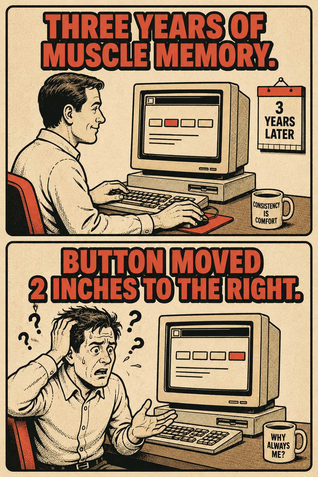
When a product team ships a major UI redesign, they are breaking muscle memory. For a user who has spent three years working in your software, navigating the interface is an unconscious act. They do not read the labels on the buttons. Their mouse simply goes to the top right corner when they want to export a report. When you move that button, you force them to become conscious of the tool again. You turn an expert user back into a beginner.
The emotional response to this is not curiosity. It is frustration.
Release notes are the first line of defense against that frustration. When written well, they provide a cognitive map that helps users re-orient quickly. When written poorly, they trigger support ticket spikes, adoption friction, and angry comments on Reddit.
The Problem with Treating UI Changes Like New Features
Most release notes fail because they treat UI changes the same way they treat new features.
When you release a new feature, users are learning something new. The goal of the release note is to explain what the feature does and why they should care.
When you redesign an interface, users are relearning something they already knew how to do. The goal of the release note is not to sell them on the new design. It is to acknowledge the friction and guide them through it.
If your release notes say, "We've streamlined the interface to provide a more modern experience," you are failing. That is a marketing sentence, not a map. To a user who can no longer find the billing page, "streamlined" reads as evasion.
You need to be specific. "We moved the export button to the top navigation bar." "The billing page is now under Account Settings." Text-only descriptions force users to guess. Use visual comparisons. Annotated screenshots, before-and-after layouts, or short GIFs showing the new path are far more effective than a paragraph of prose describing what moved where.
This distinction between new-feature notes and redesign notes matters because change aversion works differently. With a new feature, the user has nothing to unlearn. With a redesign, they have years of habit working against them. Research on muscle memory in interaction design confirms that users develop unconscious spatial and motor patterns around interface elements — and that disrupting those patterns imposes a real cognitive cost, not just an emotional one. The notes need to account for that.
How to Actually Structure the Notes
Do not lump everything into a single list of changes. Break the release notes into tiers based on how the changes affect the user's workflow.
Start with the why. Users need to understand the motivation behind the disruption before they will accept it. If you rebuilt the UI to support mobile devices, or to fix accessibility issues, or to lay the groundwork for a major feature coming next quarter, say so. A user who understands the reason for the disruption is far more likely to tolerate it.
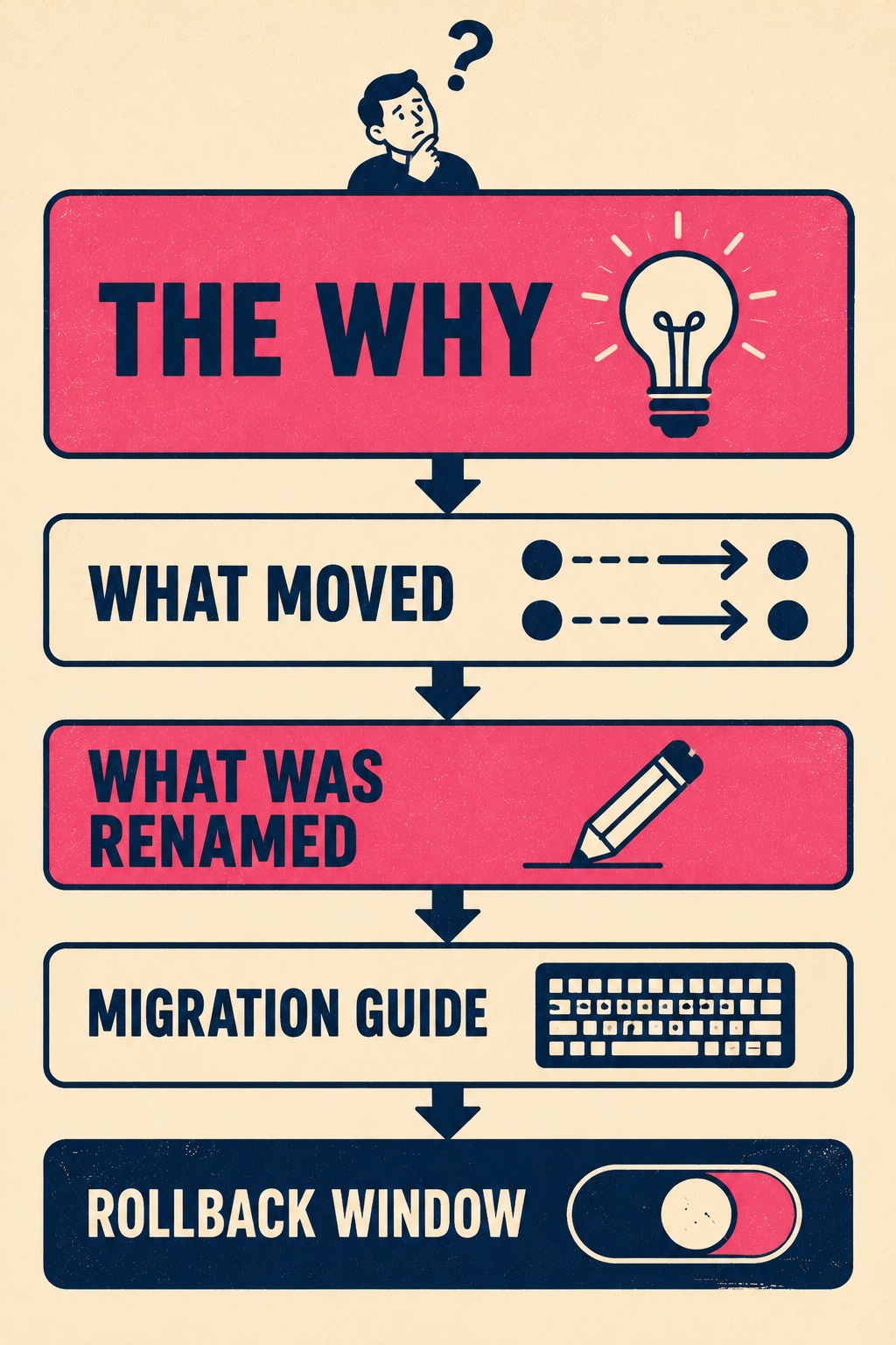
Then, organize the changes into clear categories. What moved and where it went. What was renamed. What was removed. What is genuinely new. These are different kinds of information and they require different kinds of attention from the reader. Lumping them together forces the user to sort through everything to find the one thing that affects their workflow.
If you are sunsetting a popular feature, name it explicitly. Explain why it is gone and provide the alternative workflow. Burying deprecations in the middle of a redesign announcement erodes trust faster than almost anything else you can do.
For power users, include a dedicated migration guide. List the keyboard shortcuts that changed. Document any URL structure updates if they rely on bookmarks. Acknowledge the transition cost directly. Saying, "This new layout may take a few sessions to feel natural," signals that you understand their experience. It is a small phrase, but it does real work.
And if there is a rollback window, make that explicit. A period where they can toggle back to the old UI while they finish an urgent task is incredibly valuable. Uncertainty makes people angrier than bad news. If there is no rollback option, explain why.
The Part Where Everyone Has to Talk to Each Other
Writing these notes requires input from design, product, support, and engineering. No single person has the full map.
The person writing the notes needs access to the user research that informed the redesign. Knowing what users struggled with in the old UI helps frame the new one. If the old navigation was confusing for mobile users, that context belongs in the notes. It turns the disruption into a story with a reason.
Support teams need advance access to the notes so they can prepare response templates before the tickets start coming in. Teams that have shipped major UI changes without giving support a heads-up tend to find out about that mistake very quickly. The K15t team documented this directly: after making significant changes to their UI, they saw a surge in support tickets from confused customers, and they acknowledged that better upfront communication would have prevented most of it.
If you run a beta or preview period, incorporate feedback from early adopters into the final release notes. They will tell you exactly which changes are the most confusing. That information is more valuable than any internal review.
Timing matters. Release notes for a major redesign should go live before the update ships to all users, not simultaneously. If you are doing a phased rollout, explain who is getting it when and why. Consider creating a dedicated landing page for the redesign that persists beyond the initial release notes, because users will need to reference it multiple times. The first time they read it, they are preparing. The second and third times, they are looking for something specific.
Knowing If It Worked
You will know if your release notes failed within the first week.
It is worth noting that users do read release notes. A survey of 372 respondents found that 83.6% said they read release notes or app updates. The majority cited wanting to know what changed as the primary reason. That means when your notes are unclear, a lot of people are walking away confused, not just a handful.
Track your support ticket volume compared to a normal week. A spike is expected after any major redesign, but the nature of the tickets tells you whether the notes did their job. If tickets are full of phrases like "where is," "can't find," or "how do I," your notes did not land. Those are not questions about the design. They are questions about the map.
If you use session replay tools, look for repeated back-and-forth navigation patterns. That is the digital equivalent of someone wandering the aisles of a grocery store looking for the milk. It means they are hunting for something they used to know how to find. NPS scores and open-ended feedback comments will also spike negative if the communication failed, and the comments will tend to be about confusion rather than the design itself.
The Bottleneck Most Teams Hit
Major UI redesigns generate a documentation workload that arrives all at once, under tight deadlines, and requires input from people who are already underwater shipping the redesign itself.
If your team is lean, or your technical writers are stretched across multiple product lines, this is where the process usually breaks down. The release notes get written at the last minute by a product manager pulling Jira tickets into a Google Doc, trying to reconstruct context that was obvious three weeks ago and is now scattered across Slack threads and design files.
That is where a tool like Doc Holiday becomes operationally relevant. It generates the structural scaffolding (what changed, what moved, what is new) directly from the engineering workflow. It gives the writer a real foundation to refine instead of starting from scratch. The human writer brings the why, the tone, and the migration guidance. The system handles the extraction and organization, ensuring that the documentation matches the actual build without requiring a heroic effort at the eleventh hour.
You cannot prevent users from feeling disrupted by a major UI change. But you can give them a map.