How to Measure Documentation ROI


Picture the meeting. Someone from finance is asking what the documentation budget is actually producing. The head of support is in the room. So is the VP of Engineering. Everyone agrees that good documentation is important. Nobody has a number.
That is the situation most documentation leaders find themselves in when budget season arrives. The value of documentation is real and widely understood, but it is also diffuse. It shows up in support tickets that never get filed, in developers who integrate your API in two hours instead of two days, in new engineers who reach their first production commit in a week rather than a month. Because those benefits scatter across departments, they rarely roll up into a single line item that finance can evaluate.
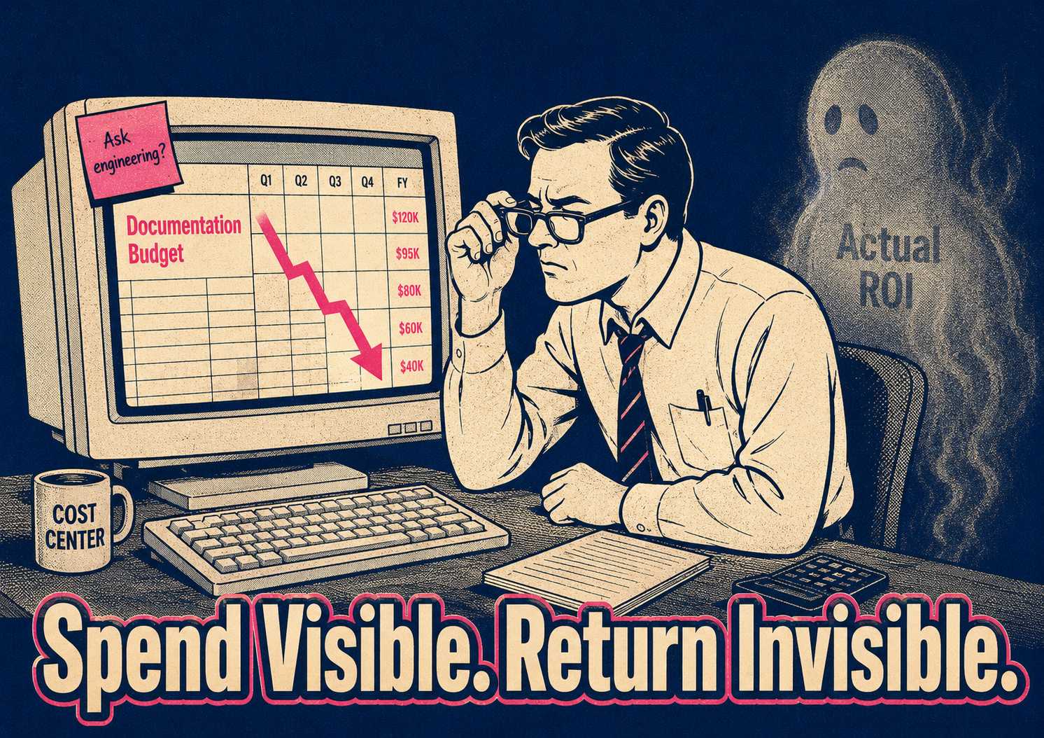
Most organizations know exactly what they spend on documentation. They can tell you the headcount cost (writers, editors, managers), the tooling cost (CMS platforms, hosting, search infrastructure), and the opportunity cost of engineering time spent reviewing, updating, or rewriting docs. Almost none can tell you what they get back. The spend is visible. The return is invisible.
The good news is that measuring documentation ROI is possible. It requires separating the metrics you can track immediately from the ones that take time to appear, and then building a baseline before making any changes. Here is a practical framework for doing that in the next 30 days.
What You Can Measure Right Now
Leading indicators are the metrics that correlate with downstream value and can be tracked without waiting for long-term trends to develop.
Support ticket deflection rate is the most direct measure of documentation utility. The two numbers to track are the percentage of users who visit the documentation before opening a ticket, and the percentage of tickets that get closed with a link to an existing document. For context on why this matters financially: SaaS support tickets cost between $18 and $35 each for human-handled interactions. A company handling 10,000 tickets annually that deflects 15% of them through better self-service documentation saves somewhere between $27,000 and $52,500 per year. That is a conservative estimate, and it is a number you can put in a slide.
Time to first value is the critical metric for new users and developers. For an API product, this is the time from signup to the first successful API call. For a SaaS platform, it is the onboarding completion rate and the time from account creation to the first meaningful action. The Postman team has argued for years that time to first call is the most important API metric because it determines how many developers make it through the adoption funnel at all. Documentation quality is the primary lever for improving it.
Documentation coverage and freshness capture the operational health of the knowledge base. Coverage is the percentage of features, APIs, or workflows that have up-to-date documentation. Freshness is the percentage of documentation updated within the last quarter, or the average lag between a product release and the corresponding documentation update. These are leading indicators of a different kind: they predict where the support volume is going to come from before it arrives.
The lagging indicators take longer to appear but carry more weight in a budget conversation. The reduction in support costs per user over time is the ultimate financial validation of documentation investment. As the user base grows, support volume should not scale linearly if the documentation is doing its job. Developer productivity metrics capture the internal value: the time it takes to integrate a new tool, the time required to deploy a feature, the onboarding time for new engineers. Poor internal documentation can cost a mid-sized engineering team between $500,000 and $2 million annually in lost productivity, delayed projects, and context switching. Customer satisfaction scores and churn rates often correlate with documentation quality, and segmenting those numbers by documentation engagement can reveal how self-service success affects revenue retention.
The reason you need both types of metrics is timing. Leading indicators let you course-correct quickly. Lagging indicators prove long-term value but arrive too late to save a program that is already underperforming. You need both to build a complete picture.
The Attribution Problem, and What to Do About It
Most of these metrics are influenced by multiple factors. You cannot definitively prove that documentation alone caused a 15% reduction in support volume. A product improvement, a better onboarding email sequence, or a change in the customer mix could all be contributing.
What you can do is establish baseline measurements, make a documented change to documentation quality or coverage, and track the movement. The goal is not courtroom-level proof. The goal is a defensible narrative backed by directional data.
A practical 30-day starter plan makes this manageable.
In the first week, instrument what you do not currently track. Set up basic analytics on documentation traffic. Tag support tickets that include a documentation link. Survey a small sample of users who visited the documentation in the last seven days.
In the second week, establish the baselines. Calculate the current support ticket volume. Determine what percentage of users engage with the documentation. Measure the average time-to-resolution for common questions.
In the third week, identify one high-impact intervention. Pick a poorly documented feature that generates high support volume, or a gap in the onboarding documentation that correlates with user drop-off. Improve that specific section.
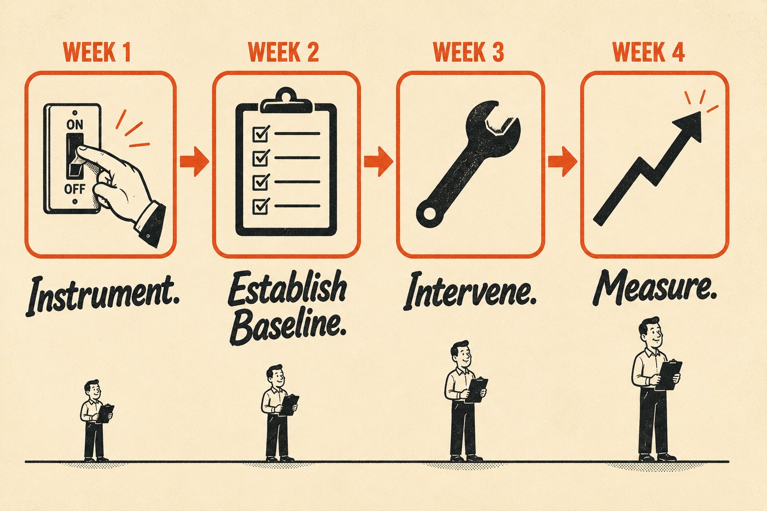
In the fourth week, measure the movement. Track whether ticket volume dropped for that feature. Check if onboarding completion rates improved. See if time-to-first-value decreased.
This process will not produce a perfect ROI calculation. It will produce a credible before-and-after story, which is what leadership actually needs to make a budget decision.
The Headcount Question
If the real question behind measuring ROI is whether the company should cut the documentation team, the framework above will help clarify the value. It will not resolve the deeper structural issue: documentation work is expanding. More features, more APIs, more integrations, more compliance requirements, while budgets are flat or shrinking.
The traditional response to expanding scope is to add headcount. The modern alternative is to change the unit economics of documentation entirely.
By automating the generation layer (the release notes, changelogs, and API references), existing teams can focus on the high-judgment work that actually differentiates the documentation: the tutorials, architecture guides, and complex troubleshooting scenarios that require genuine understanding of how users think. The 2024 DORA State of DevOps Report found that a 25% increase in AI adoption is associated with a 7.5% improvement in documentation quality, which suggests the leverage is real when the tooling is structured correctly.
This is where the measurement framework becomes strategic. If you can show that auto-generated documentation performs as well as hand-written documentation on support deflection and user satisfaction, you change the conversation from cost-cutting to leverage. The documentation team is no longer defending its headcount. It is demonstrating that it can scale output without scaling cost.
Doc Holiday provides the operational structure for this shift. It generates documentation directly from engineering workflows, creating first drafts from code commits. A senior writer reviews the output for accuracy in a dashboard, flags edge cases, and feeds patterns back to reduce hallucinations over time. It gives lean teams the model to validate, manage, and scale their output without rebuilding a large headcount.
The measurement framework you build in the next 30 days is not just a defense against budget cuts. It is the evidence base that makes the case for doing documentation differently.